Data Visualizations
Alibaba has released a dataset from one of its production clusters. The 2017 dataset includes about 1300 machines over a period of 12 hours. The 2018 dataset is much larger, and includes more information over a longer period of 8 days. These datasets were visualized in various ways using the data visualization code framework D3.
Note: due to the massive datasets involved, some of these images are extremely long, and their details may be better viewed by opening them in a separate browser window.
server_usage shows around 1200 servers, focusing on their load over a minute. Lines with the same slope and undulations indicate a number of machines (most likely) carrying out the same task for the same company, indicating how coordinated much of this processing is.
server_memory is more of a heatmap using the same data, with hotter colors indicating closer to 100% memory use. Of note here is how on the one hand, a significant portion of the cluster is ‘always on’ and intensively processing, while on the other hand, a huge number of machines have low or very inefficent use throughout the day.
batch_task draws on another much larger dataset of 13000 ‘jobs’ carried out by alibaba servers over the same period. It shows when jobs start and stop throughout the day. Long lines indicate long running jobs that may take hours to finish. Shorter ‘cascades’ or ‘waterfalls’ indicate machines moving through a series of shorter jobs.

cpu_core shows the cpus assigned to jobs over the 12 hour period. In this cluster, a job can be assigned to any one of 64 total machines. In practice, jobs are typically assigned to 4 or 8 cpus at a time, indicated by 4 or 8 lines next to each other. Alibaba attempts to balance cpu load by allocating jobs to cpus not in use. A ‘perfectly’ load balanced cluster strives to equally allocate jobs across the cluster, giving new jobs to unused cpus – in this visualization, to never have repeating lines. The visualization indicates instead that some cpus are selected repeatedly over the 12 hour period, showing up as thicker lines.

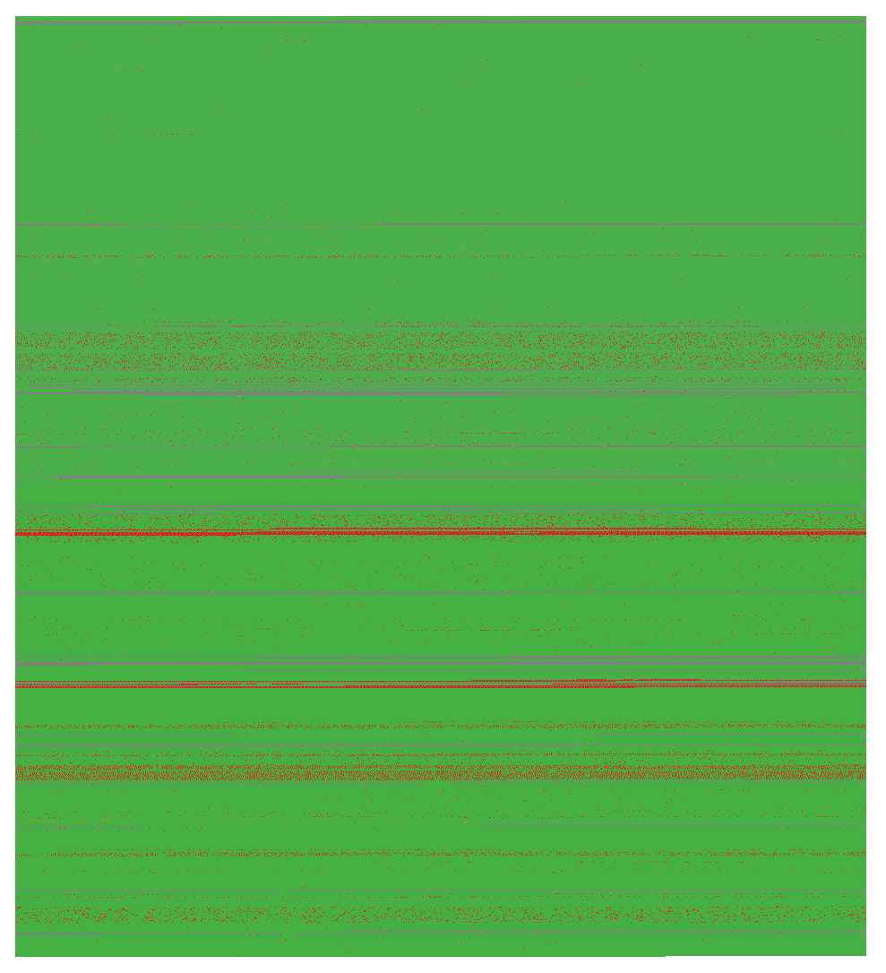
instance_status focuses on the status of 1 million Alibaba instances over time. Each pixel is one instance. Ready and Waiting instances are displayed in grey, Running in green, Terminated and Failed in red, and Cancelled and Interrupted in orange. While green dominates the image, indicating that most instances complete with no issues, a number of red and grey dots also show that waiting and failed instances are not uncommon.
mpki is a relatively technical interrogation that focuses on an industry metric termed missed-predictions-per-thousand (k)-instructions, or mpki. It refers to the ability of a processor to carry out branch prediction. In order to achieve optimal processing, this number should be as close to zero as possible. The color scheme here ranges from blue to pink, using a scale of 0 – 20 mpki. The sea of blue in the image thus indicates very low misses and high processor performance. Yet the dappled pink dots interspersed throughout show that processing is not perfect, and up to 20 predictions per 1000 can be missed at times.

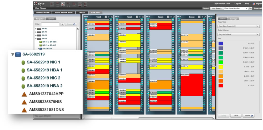
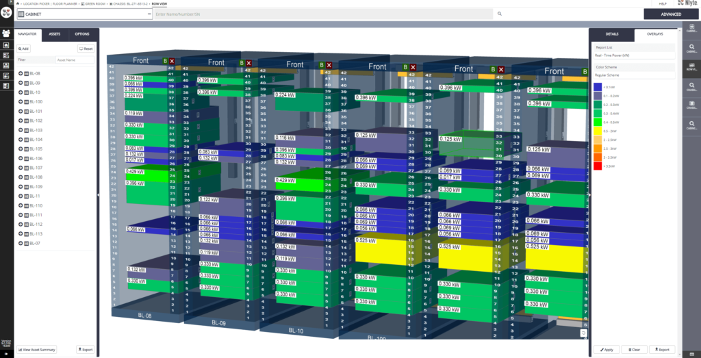
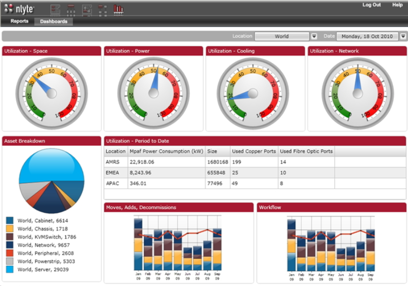
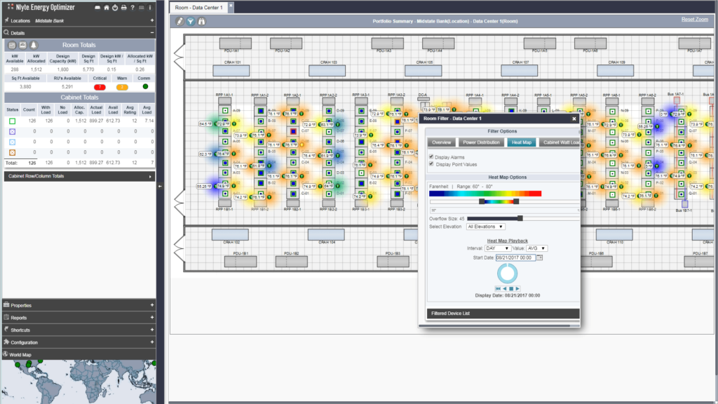
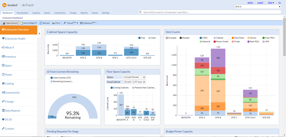
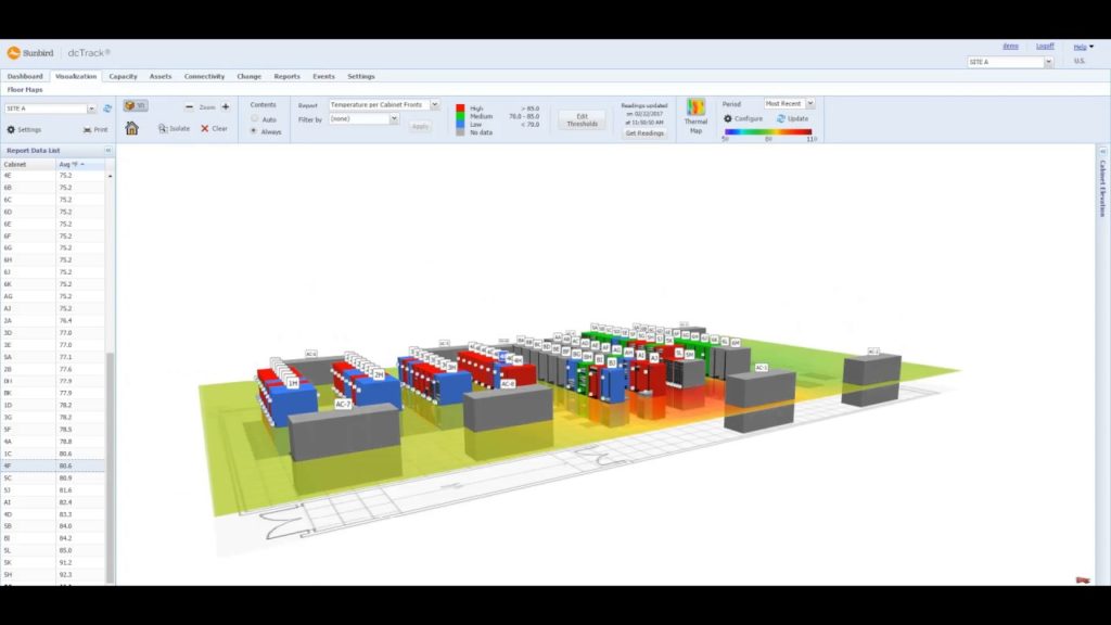
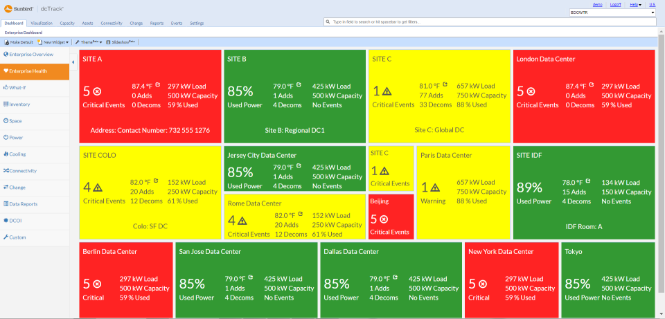
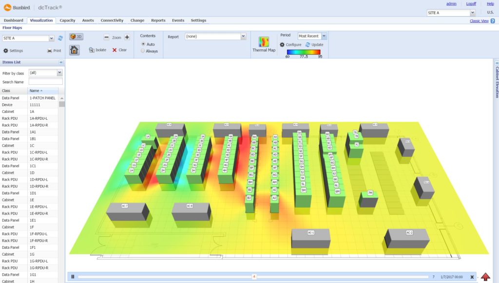
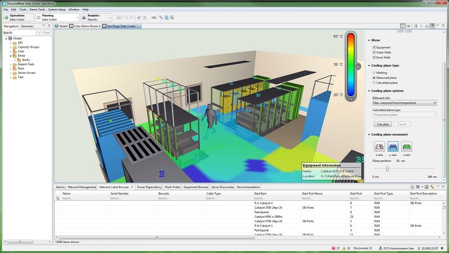
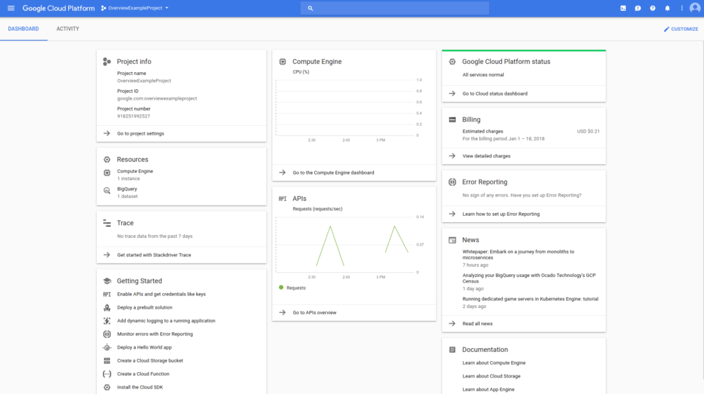
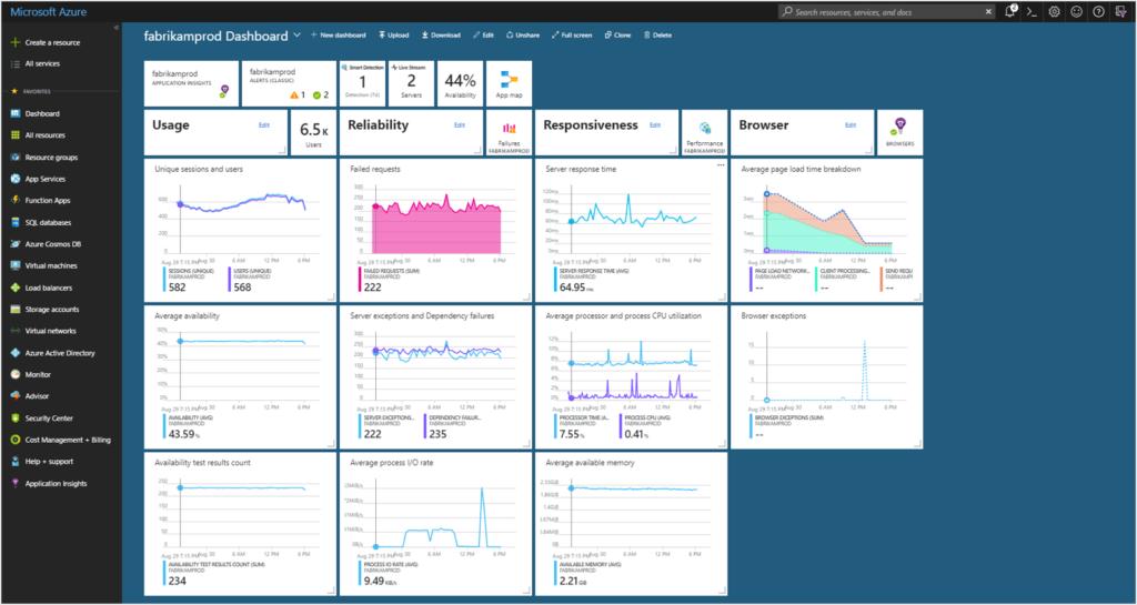
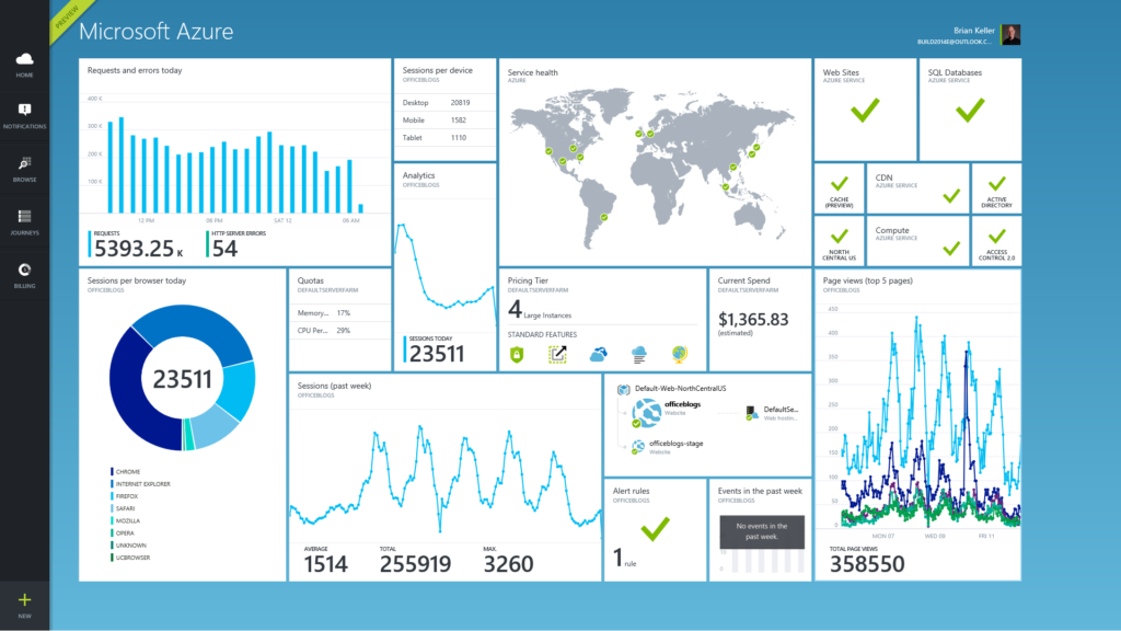
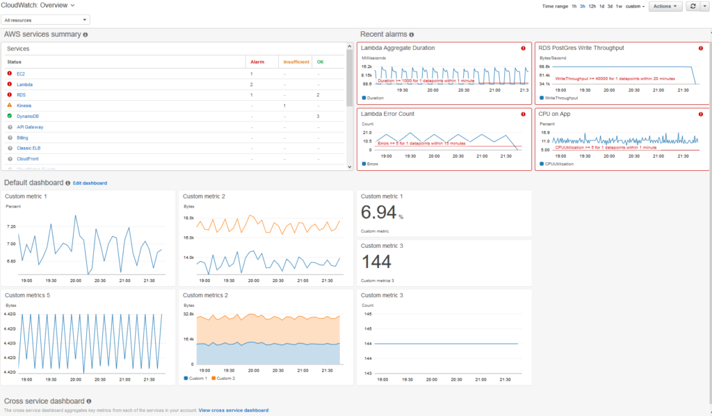
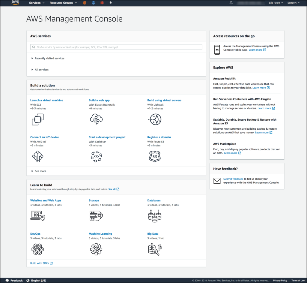
The images below take two forms: dashboards and DCIM. Dashboards are used by cloud providers such as Amazon Web Services and Microsoft Azure to show customers the instances they are using, the costs they are incurring, the status of particular jobs, and so on. DCIM software, by contrast, is the acronym for data center infrastructure management. DCIM is used by data centers to provide them with an overview of their facilities, including temperature, energy input, safety notifications, etc. DCIM software can also be used to test alternate configurations, allowing an engineer, for instance, to test the result of installing new memory or cooling in their cluster before they make the change in the real world.